top of page

BRIEF | WOO MORE PLAY ICONS
GRAPHIC DESIGNER, ILLUSTRATOR
I designed and reiterated icons for WOO More Play's "key ingredients" within their products. The brand was looking for an icon upgrade that would translate what the ingredient is while: being cute as well as maintaining more classic minimalism in drawing style.
With the thin line work sketch-style drawings added with a heavy handed usage of the brand's colors, I designed a set of aesthetically branded icons for use on their website and/or product packaging. The pinks and greens of the icons keeps the designs fresh and fun while the style of illustration elevates the brand, therefore lifting the target audience's age as well.
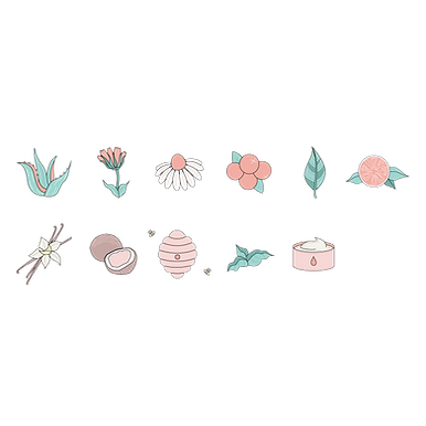
FINAL PRODUCT


CALENDULA FLOWER
HYDROXYETHYLCELLULOSE
COCONUT
VANILLA
MATRICARIA FLOWER
STEVIA
PROPANEDIOL
CRANBERRY
BEESWAX
ALOE VERA
CITRIC ACID


bottom of page